A screenshot of our new dashboard at ridership.streetsforall.org
It’s hard to use LA Metro’s ridership dashboard. We built a new one.
Table of Contents
We are excited to announce SFA’s Metro ridership dashboard
We hope this tool can help advocates, policy makers, and maybe even Metro staff more quickly understand ridership trends across the system. Some primary features are:
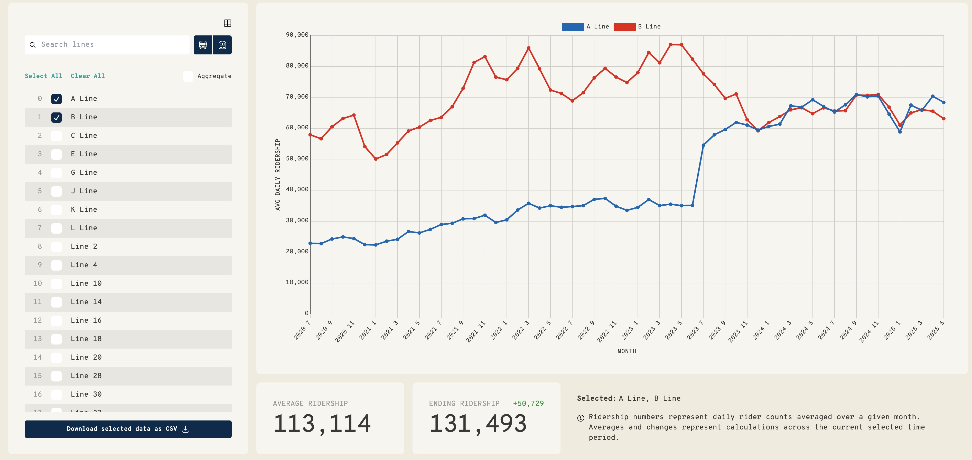
- Quickly selecting lines to see ridership over time
- Line search, filter, and sort functionality
- Downloading custom ridership selections
- Easily comparing lines against eachother
- Aggregating groups of lines to see trends
Have feedback? Use this form
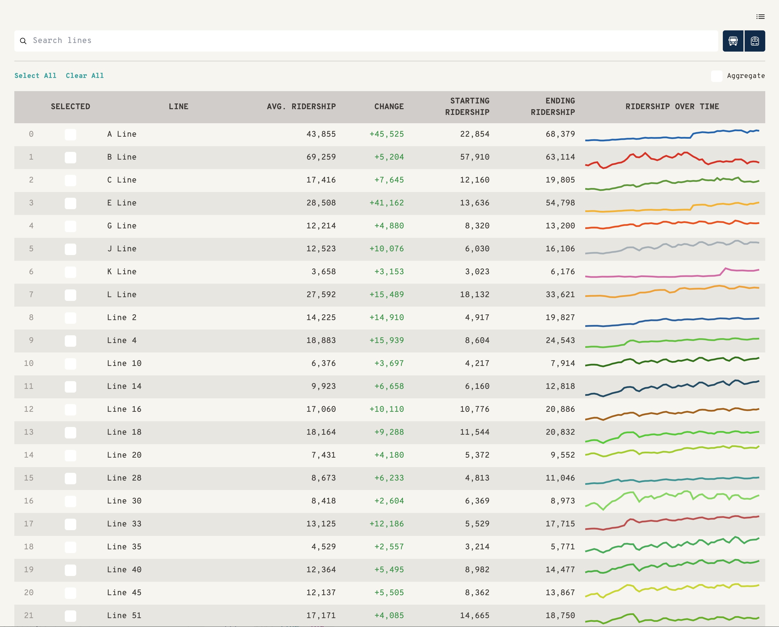
Table View in our dashbaord
The primary goal of this site is to make reading ridership data easier. We have two different views for analyzing ridership data: line graphs and tables. In the line graphs view, we can select multiple lines we want to compare for a given timeframe along with initial and final monthly ridership numbers. Aggregation allows users to collectively view ridership for a set of lines. If people want to do their own analysis, users can download monthly ridership data as a CSV.
Why we built it
Throughout our advocacy work, it’s often a significant ordeal to get access to the data we need. Battles happen across public records requests, under the table handoffs, or reverse engineering APIs (as we did to run our Vision Zero Twitter Bot which posted local traffic crashes from the Citizen App).
One ongoing pain point for our team has been Metro’s ridership dashboard. This antiquated ASPX web page provides the number of daily riders across Metro’s bus and rail system. Values are returned per line, per time range, per request, making it impossible to compare lines with each other, aggregate lines together, or see larger ridership patterns without scraping data or manually copying cells of tables into a separate document. The dashboard is embarrassingly deficient compared to easily downloadable ridership data from NYC or Chicago’s transit providers.
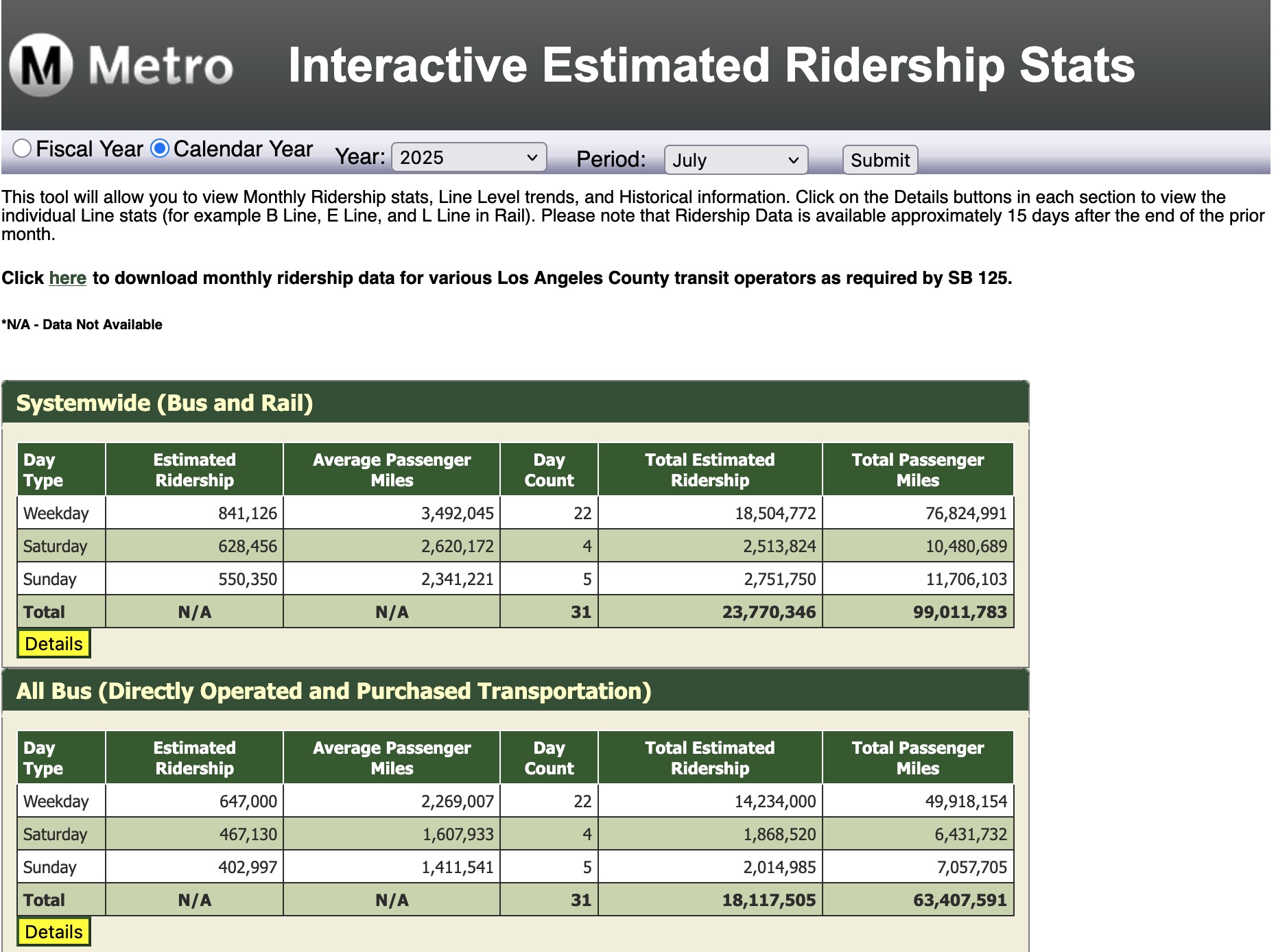
Metro’s Existing Ridership Dashboard (opa.metro.net/MetroRidership/)
Data Structure
We believe open, standardized, and accessible data is part of a healthy advocacy and research ecosystem. We were fortunate to receive monthly ridership data from Metro, which we then converted into a standard JSON format.
Metro currently tracks daily ridership by using sensors to determine how many people enter and exit a train/bus. In addition, this daily ridership data is organized into three different day groups: Weekday, Saturday, and Sunday. Different groups are used because ridership is significantly affected by trends like work days or leisure days. Those data are tracked under months as well.
Ridership data provided by Metro had a different structure than the Ridership Dashboard and required additional processing. Monthly ridership data is split by shakeups - semiannual service changes to optimize the routes and schedules of buses and trains. So to calculate correct monthly averages for service change periods (typically, June and December), we prorated the data based on the number of days before and after each shakeup. For our dashboard, we separated ridership metadata from the averages and converted both to JSON format.
Next Steps
We are engaging with Metro to see if they can build a live API for us to automatically update the data (currently we are manually updating the site when we receive new data from Metro). We also want to build out a ‘context’ functionality that saturates lines with point-in-time events to help users understand why ridership trends change (e.g., the drop in A Line ridership in 2018 due to track closure for maintenance, the rebound in 2019 when they reopened, the cliff in 2020 due to COVID, and then the doubling of ridership in 2023 when the Regional Connector opened). One could imagine increasing levels of granularity here, eventually including line adjustments, stop closures, or frequency increases.
To make searching and sharing data easier, we may at some point add user profiles with saved aggregation and URL query parameters with set filters.
Other site improvements we’ve discussed include a dashboard for stop- level data (as we used in our Bus Delay Analysis), a map- based ridership view, and potentially extending the site to include data from other transit providers like Dash, Long Beach Transit, or Big Blue Bus.